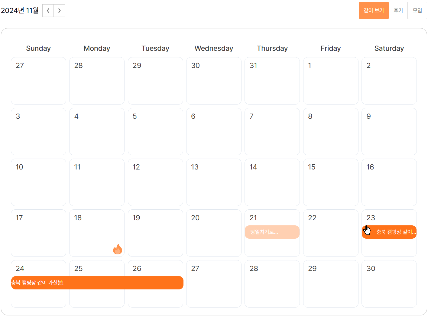
목표
위 사진에서 보이는 같이보기, 후기, 모임 버튼 상태에 따라 데이터 출력하기
불 아이콘이 후기(stamp), 막대처럼 길게 늘어져 보이는게 모임(meet) 데이터임
기본 구조
컴포넌트
Calendar
  ├─CalendarHeader
  └─CalendarTable
      └─CalendarCell
데이터
{
    "2024-11-18": [
        {
            "type": "stamp",
            "typeId": "578ad71c-bcf7-48cf-8560-0e9ae6c3ce43",
            "contentId": 10,
            "content": "(주)아웃오브파크",
            "startDate": "2024-11-18T06:53:36.461",
            "endDate": "2024-11-18T06:53:36.461",
            "id": "stamp-578ad71c-bcf7-48cf-8560-0e9ae6c3ce43",
            "date": "2024-11-18T06:53:36.461",
            "isExistPrev": false,
            "isExistNext": false,
            "isShowContent": true,
            "range": 1
        }
    ],
    "2024-11-23": [
        {
            "id": "meet-138-1",
            "date": "2024-11-22T15:00:00.000Z",
            "isExistPrev": false,
            "contentId": 100389,
            "range": 1,
            "typeId": 138,
            "type": "meet",
            "content": "충북 캠핑장 같이 가실분!",
            "isExistNext": true
        }
    ],
    "2024-11-24": [
      // 이하 생략 . . .
    ]
}
위의 데이터를 보면 후기(stamp)와 모임(meet) 데이터가 하나의 날짜 객체 안에 배열로 정의되어 있다. type 속성으로 구별 할 수 있도록 만들어놓았기 때문에 해당 값으로 filter처리만 해주면 된다.
구현 로직
1. Calendar.tsx
filterType state를 하나 정의한다. 일반 string으로 값을 넣게 되면 안정성 측면에서 좋지 않다고 판단이 되어 stamp, meet, all 에 해당하는 값만 받을 수 있도록 타입을 따로 정의 해주었다. 그리고 filterType을 핸들링할 수 있는 함수도 정의한다.
export type FilterType = keyof typeof CALENDAR_FILTER;

export const CALENDAR_FILTER = {
  stamp: "stamp",
  meet: "meet",
  all: "all"
} as const;

const [filterType, setFilterType] = useState<FilterType>(CALENDAR_FILTER.all);

const handleFilterType = (type: FilterType) => {
  setFilterType(type);
};
그리고 filterType 에 따라 필터링하는 로직을 추가한다.
const filterScheduleList = scheduleList.filter((schedule) => {
  if (filterType === CALENDAR_FILTER.all) return true;
  return schedule.type === filterType;
});filterType이 "all" 이라면 무조건 true를 반환, 그 외의 경우라면 filterType과 데이터의 type 이 같은 경우에 true를 반환한다.
2. CalendarHeader.tsx
filterType과 핸들링 함수 handleFilterType을 Calendar.tsx로부터 Props로 전달 받는다. 그리고 버튼 생성 후 filterType의 액티브 상태에 따라 스타일 변경 및 onClick 이벤트를 정의한다.
<button
  className={`${filterType === CALENDAR_FILTER.all && "bg-main bd-color-main text-white"}`}
  onClick={() => handleFilterType(CALENDAR_FILTER.all)}
>
  같이 보기
</button>
<button
  className={`${filterType === CALENDAR_FILTER.stamp && "bg-main bd-color-main text-white"}`}
  onClick={() => handleFilterType(CALENDAR_FILTER.stamp)}
>
  후기
</button>
<button
  className={`${filterType === CALENDAR_FILTER.meet && "bg-main bd-color-main text-white"}`}
  onClick={() => handleFilterType(CALENDAR_FILTER.meet)}
>
  모임
</button>
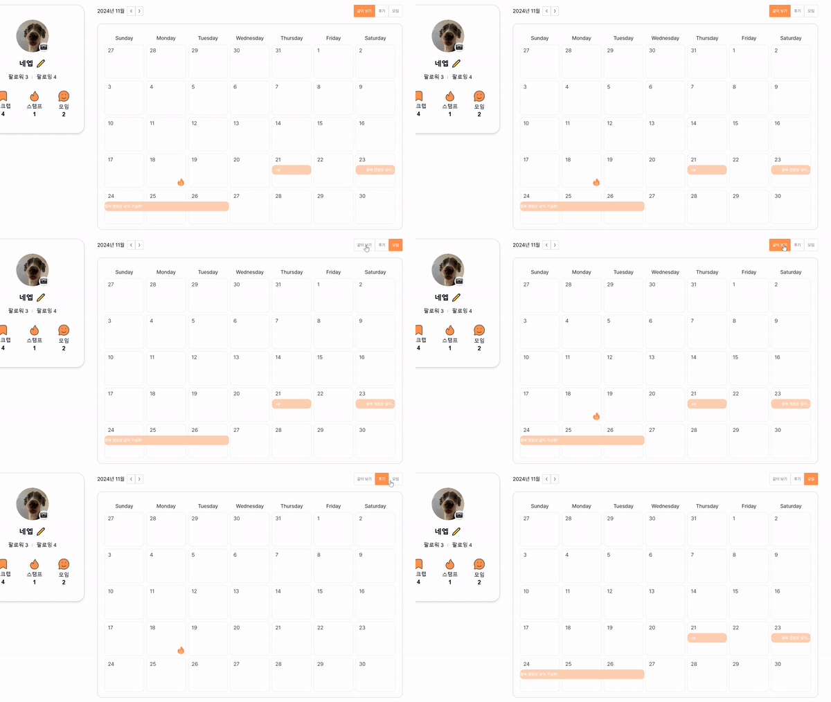
결과 테스트
1. 스케줄 데이터 가공
위에서 설명한대로 Calendar 컴포넌트에서 schedule[] 데이터를 cellCardTable로 가공한다. 로직은 함수에 따로 분리했다. 그리고 CalendarTable 컴포넌트에 Props로 전달한다.
const cellCardTable = convertScheduleDataToCellCardTable(scheduleList);
/** ... 생략 */
<CalendarTable
  currentMonth={currentMonth}
  cellCardTable={cellCardTable}
/>
2. 데이터 전달
CalendarTable 컴포넌트에서 반복하며 CalendarCell 컴포넌트를 호출한다. 이 때 해당하는 일자에 해당하는 cellCard 데이터를 전달한다.
{days.map((day) => (
  <CalendarCell
    key={day.toISOString()}
    day={day}
    cellCardList={cellCardTable[format(day, "yyyy-MM-dd")]}
  />
))}
</ul>
3. 렌더링
이제 렌더링만 잘 되면 끝인데 그 전에 우선 stamp데이터와 meet 데이터를 분리한다. (표시되는 스타일이나, 위치가 다르기 때문)
const stampCardList = cellCardList.filter(
  (cellCard) => cellCard.type === "stamp"
);

const meetCard = cellCardList.find((cellCard) => cellCard.type === "meet");
그리고 meet의 경우 style을 정의할 때 약간의 로직이 들어가기 때문에 style 함수를 따로 분리했다.
이전 혹은 다음 일정이 있는 경우 좌우 padding을 추가하고 range만큼 width를 설정했다.
const meetCardStyle = getMeetCardStyle(meetCard);

export const getMeetCardStyle = (meetCard: CellCard | undefined) => {
  if (!meetCard) return {};
  const paddingLeft = meetCard.isExistPrev ? "0px" : "32px";
  const paddingRight = meetCard.isExistNext ? "0px" : "32px";
  const style = {
    width: `calc(101% * ${meetCard.range})`,
    paddingLeft,
    paddingRight
  };

  return style;
};
마지막으로 렌더링을 시켜주면 끝!
<div className="h-[50px]">
  {meetCard && (
    <div
      className='absolute top-2'
      style={{ ...meetCardStyle }}
    >
      <div className='w-full'>{meetCard.content}</div>
    </div>
  )}
</div>
{/** stamp 렌더링은 생략 */}
결과
3차 구현 마무리
처음엔 기본적인 캘린더를 구현하는 것 조차 부담스러웠고 라이브러리를 사용할까 했지만 확실히 처음부터 직접 구현하는게 이후 커스텀하기는 훨씬 편한 것 같다고 느껴진다.
캘린더 업그레이드 체크리스트
실제 데이터 기준으로 동작되도록 변경 (선행 작업 이후 진행예정)✔️현재의 이 조잡한 디자인을 빨리 바꾸고 싶지만 실제 데이터가 생성된 후 진행 예정✔️필터링✔️- 일정부분에 mouseEnter, click 이벤트 추가